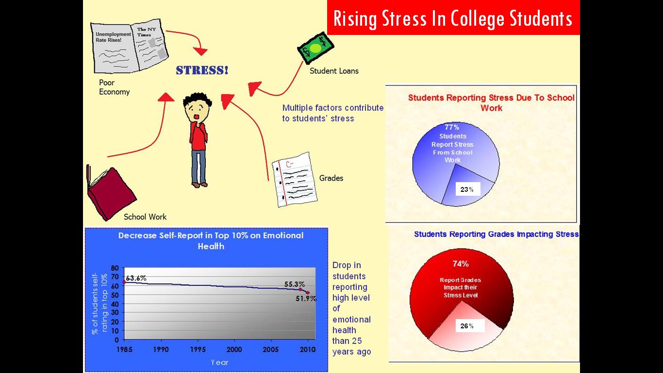
About a month ago I read an article in The New York Times that discussed how stress levels of college students have reach record high amounts. I was interested in conveying this information because of its relevance to the Mary Washington community. Often students can be heard complaining about 3 tests in one week, or important assignments they are worried about getting an A on. Despite preparation efforts that students put in to their work, sometimes it is not enough because there is simply too much to do. This stress is multifaceted; it comes from part-time jobs, pressure to get top grades, and even interpersonal conflict. The main thing I wanted to convey through my infographic was the increase in stress levels and the multiple sources that contribute to its formation.
For this project I researched studies that assessed this stress increase in college students. I found data from the annual UCLA survey that provided the statistics on my line graph. I wanted to show the 3.4% drop in the students who considered themselves high in emotional health from 2009 to 2010, and also show the trend since 1985, when the survey was first created. The graph shows a general decrease since the first assessment, but the most recent 3.4% drop appears to be one of the largest. I found another site that gave statistics on the percentage of students who report that grades and school work contribute to their stress and represented this data in separate pie charts. I felt that the pie chart best depicted how large the 77% and 74% of students who said yes are in comparison to those who disagreed. Finally, I used The New York Times article that originally sparked my interest in this topic to construct a simple stress map. I created this image using Paint. I feel that I accomplished my goal for this graphic, which was to display some of the different sources of stress that college students are exposed to, and overall I feel it conveys the overwhelming sense of managing all these different factors.
In constructing this overall image I tried to incorporate Robin Williams' 4 basic principles; however one of the biggest obstacles of this project was finding a way to fit all my graphics in one image. First I tried Paint, but I soon realized that Microsoft PowerPoint was more effective, though this lack of space did make it difficult to include Williams' principles. One of the most evident examples of contrast actually came about accidentally; the soft neutral tan color of the image opposes the harsh black that surrounds the sides of the image (which was a result of the screen shot I took of the image in presentation view). Proximity is about placing objects on the page in order to convey a relationship; placing like objects together and opposite items a part. Keeping this principle in mind I placed the 2 pie charts so close that they could be viewed as one image. I also tried to keep the line graph some what near the pie charts since they are both graphs, but once again the limited space made it difficult to position things too far away. I used the third principle, alignment, in positioning the title and pie charts on the right, the stress map and line graph were placed on the left. I tried to avoid the center but it ended up being the only place my captions would fit. The final principle is repetition. I kept the colors consistent through out this image, most frequently using red, blue, and white. Notably, the pie charts contrast in the colors used for certain features. For instance one has a blue title and red pie, while the other has a red title and blue pie; this contrast also displays repetition in the color scheme used.
One of the biggest challenges of this image was finding a canvas large enough to fit all the images in and still make it readable. Another disappointment is that some of the text in the graph is not as clear as I hoped because the image became a little distorted when copied and pasted into another program. Overall though, I am pleased with how the infographic turned out.
Sources:
http://www.heri.ucla.edu/pr-display.php?prQry=55
http://www.nytimes.com/2011/01/27/education/27colleges.html
http://www.campuscalm.com/did_you_know.html