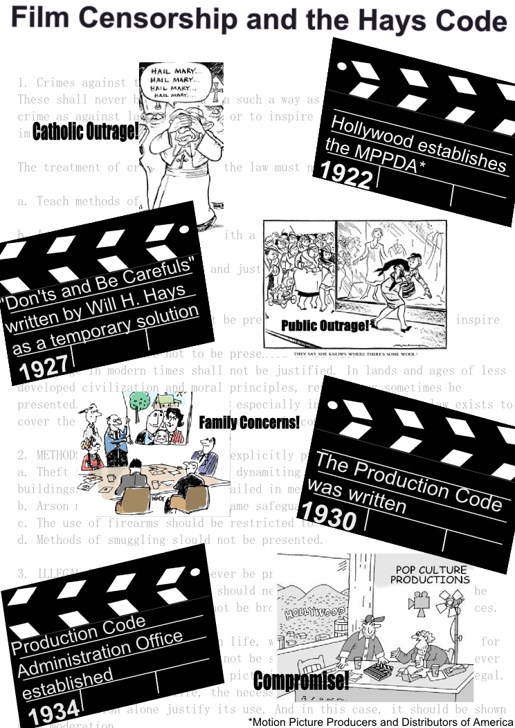
I wanted to do something related to my Senior Thesis for this project and I decided to focus on the Hays Code. The reason why I picked this is because it is kind of confusing to understand because of all the changes and because Hollywood ignored it for a lengthy period of time. The problem with visualizing such a complicated topic is well... visualizing the layout. In a way I wish I had put more thought into this one because I am not completely happy with the result.
For one thing, it looks to busy for me for some reason. I attribute this to the cartoons I had found, in a way they are distracting. Normally I would have drawn out the cartoons myself, but I am working on about 4 other projects right now and simply didn't have the time. (It also didn't help I completely forgot about this project over the weekend because I was working on another one) Either way, I still think I learned something from this assignment because I can look at what I made and analyse why it doesn't work. Next time I will make an info-graphic I will try to keep that in mind.
One of the things I am really proud of though is the clapper boards! I kind of like the idea that the clapper boards represent a new scene in the history of the Hays Code, if I had time I would have tried to play with that idea more. And the Alignment is pretty simple as well, it is symmetrical and I feel like your eyes just follow the images/text down the page. (at least I hope!) Finally, on a whim I decided to paste in a part of the actual Production Code for the background. I don't know why I did this but I feel like it adds another layer to the info-graph. I just hope it wasn't so distracting that the main subject is lost.
So there were some ups and downs for this project, but I learned something for each. And it was fun!
Sources:
http://www.digitalhistory.uh.edu/historyonline/film_censorship.cfm
http://www.threshold-group.com/blog/uncategorized/virtuous-video
http://snippits-and-slappits.blogspot.com/2011/03/new-revelation-of-chil...